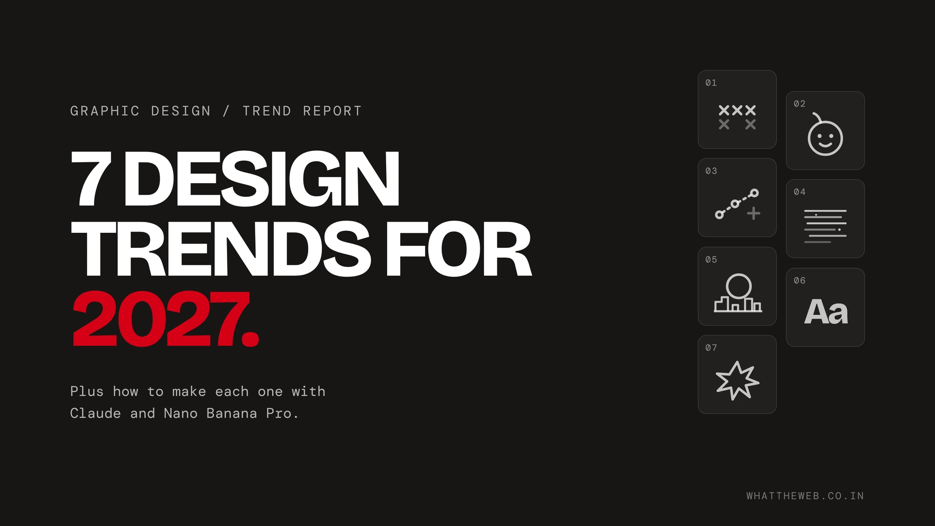
The graphic design trends to watch in 2027 all push back against smooth, same-looking AI visuals. So expect handmade and analog work, brand mascots, visible process, scanned textures, surreal CGI, expressive custom type and deliberately ugly design. Each one below also has real 2026 examples and the name people actually search for. Then I show how to make it in Claude and Nano Banana Pro.
These aren’t random. For instance, Canva named 2026 the year of “Imperfect by Design” after seeing a 90% rise in searches for DIY and collage elements. Similarly, Creative Bloq’s 2026 forecast opened with anti-AI crafting. In addition, Klingit’s Global Design Trends 2027 report already points to hand-drawn details, giant type, visible creative processes and brands loosening up. So 2027 is where these go mainstream.
I make most of my own designs in Claude and Nano Banana Pro, so that’s what the how-to parts use. Also, for the wider kit, I listed the design tools that keep your work from looking like AI slop. Each of the design trends below gets the same treatment.
| # | Trend | Also searched as | Start in |
|---|---|---|---|
| 1 | Handmade and analog design | anti-AI crafting, imperfect design | Nano Banana Pro |
| 2 | Brand mascots | AI mascots, mascot branding, cutewashing | Claude (2D), Nano Banana Pro (3D) |
| 3 | Visible process and imperfection | behind-the-scenes design, naive design | Claude |
| 4 | Scanned and found textures | scanner aesthetic, photocopy texture | Both |
| 5 | Surreal design and CGI worlds | FOOH, fake out-of-home ads | Nano Banana Pro |
| 6 | Expressive custom typography | custom typeface, handwritten fonts | Claude |
| 7 | Ugly, naive and folk design | anti-design, ugly design | Claude |
1. Handmade and analog design (anti-AI crafting)
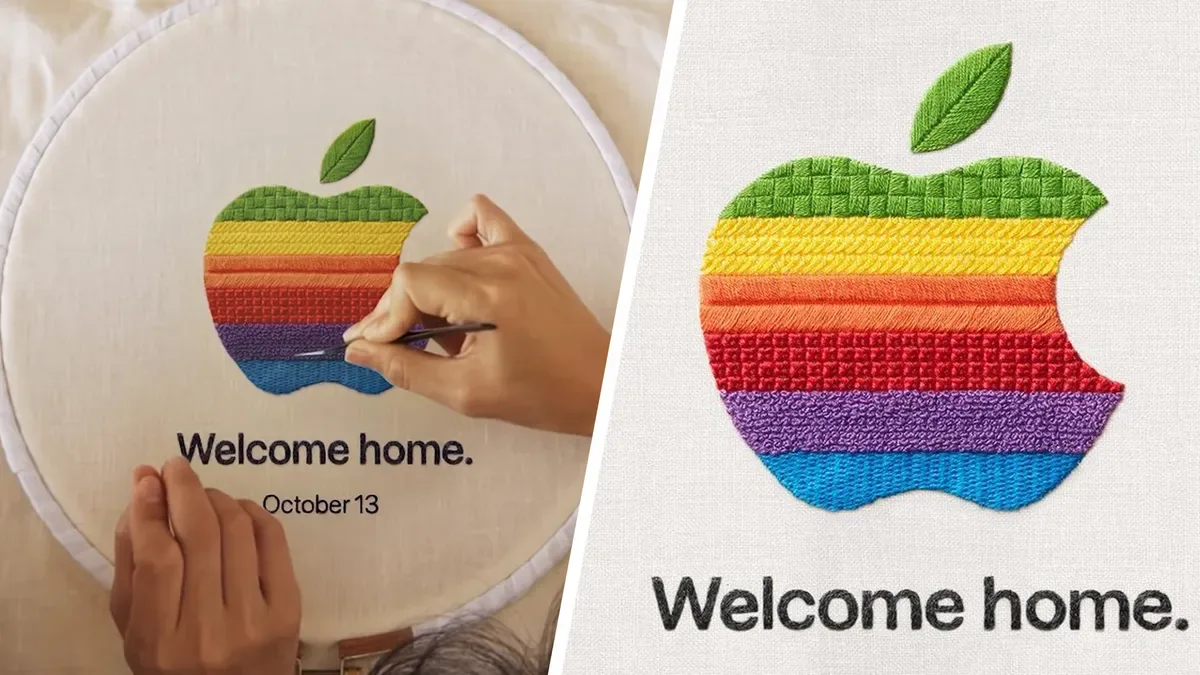
Handmade design brings a physical medium into digital work. For example, embroidery, paint, collage, film photography, cut paper. In short, if flat design is a white screen with a sans serif and tiny icons, this is the opposite.
The searchable name. Of course, nobody types “handmade analog design” into Google. In fact, the industry terms are anti-AI crafting, named by Landor’s Graham Sykes in Creative Bloq’s 2026 forecast, and Canva’s imperfect by design. So use those in your headings and alt text.
Why it tops the 2027 design trends
AI made polish cheap, so proof of a human hand became the expensive thing. Indeed, in Canva’s creator survey, 80% of US respondents agreed that 2026 is the year we regain creative control.
These design trends in the wild
- Apple’s Welcome Home invite (October 2026). The 1977 rainbow logo, hand-embroidered by Sydney twin sisters Maricor/Maricar. Apple also posted the making-of video.
- Apple TV’s intro. Filmed with a manually operated camera and a hand-blown glass apple, per Creative Bloq.
- Burberry’s Cross-Stitch Knight Life campaign. Stitched textures in a luxury campaign.
How to make it with Nano Banana Pro
Nano Banana Pro is the better starting point here because it renders real materials well. Notably, Google’s own prompting tips say to give every reference image a job.
- Photograph a real material. A thread sample, a paint swatch, a page from your sketchbook.
- Upload it and tell the model what it’s for (“use image 1 for the thread texture only”).
- Describe the object, the material, the light and the camera.
A brand logo for a coffee shop called Slow Pour, hand-embroidered in thick
cotton thread on unbleached linen. Use image 1 only for the thread texture.
Visible stitch direction, a few loose threads, slight puckering of the fabric.
Shot flat from above, soft window light from the left, 4:5, 2K.
How to make it with Claude
Claude doesn’t paint pixels. Instead, it builds designs in code, which makes it great for everything around the handmade image. So drop your Nano Banana Pro render into Claude (or Claude Design) and ask for the layout.
Build a 4:5 Instagram poster. Use the attached embroidered logo as the hero.
Off-white paper background with a subtle SVG grain. Headline in a warm serif,
sentence case, slightly rotated by 1 degree. Add a hand-drawn underline as an
SVG path with a wobble, not a straight line. No gradients, no drop shadows.
Overall, my rule for this trend: one real element beats ten simulated ones. Scan or photograph one thing you actually made, then let AI help with the rest.
2. Brand mascots and AI mascots (cutemorphism)
Brands are giving themselves faces again. Specifically, fuzzy, big-eyed characters that sit inside the product and talk to you. Also, some designers call it cutemorphism. Searchers call it brand mascots, AI mascots or mascot branding, so lead with those.
Meanwhile, Fast Company has a sharper word for the AI version. Finally, in October 2026 it called the wave “cutewashing”: making a new AI agent feel safe by making it adorable.
Why these design trends are spreading
AI agents now read your email and buy things for you. That takes trust. Cute helps. For instance, Chuo University professor Joshua Paul Dale told Fast Company that people forgive cute things for their mistakes, which is exactly why AI companies want mascots (and exactly why critics are wary).
Real examples of these design trends
- Meta Muse’s Jolly. A fuzzy, rosy-cheeked mascot designed by Muse product design lead Alex Cornell, shown at Meta Connect in September 2026.
- OpenAI’s dots and GrokBot. Both launched with cute agent characters the same autumn.
- Notion AI. A small illustrated character built into the product that reacts as you work.
- Crocs’ Niles. The croc from the logo, now a six-foot mascot written like a sitcom character, with a weekly office micro-series.
- Wikipedia’s Baby Globe. The 25th anniversary mascot started as a volunteer’s doodle on his train commute.
- Liberty Mutual’s Liberty Biberty. A fuzzy disembodied head. It got so much attention that a YouTuber planned a protest about it in Boston.
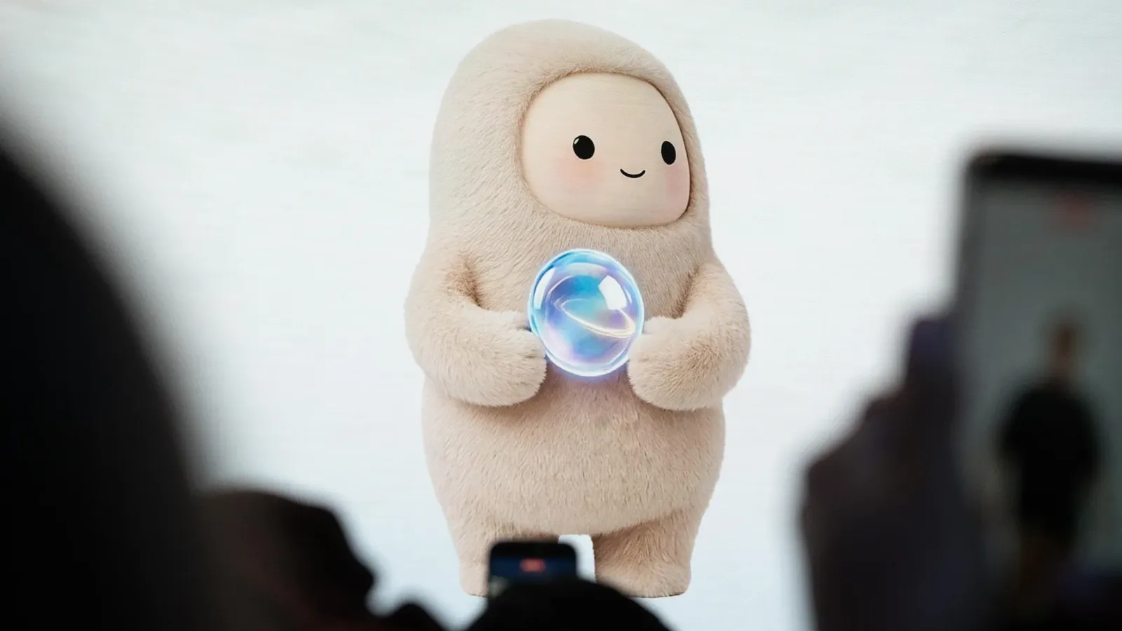
Still, that last one is the warning. After all, a mascot gives people something to love or hate. For example, PC Gamer’s writer wanted to punt Jolly into the void.
How to make it with Claude
Claude is good at flat, vector mascots because it writes them as SVG. As a result, you get clean shapes you can recolor and animate.
Design a mascot for a budgeting app called Penny. Draw it as SVG.
A round coin character with tiny arms, one slightly bent antenna and
a lopsided smile. Two brand colors only: #1F6F5C and #F4E9D8.
Give me a character sheet with four expressions: happy, confused,
sleepy, proud. Then animate the happy one with a small CSS bounce.
How to make it with Nano Banana Pro
Once the 2D version exists, Nano Banana Pro can turn it into a plush toy, a vinyl figure or a 3D render. It keeps up to five characters consistent across images and takes up to 14 reference images, so upload your character sheet every time.
Use image 1 as the exact character design. Render Penny as a soft plush
toy with felt texture and visible stitching, sitting on a wooden desk next
to a laptop. Keep the bent antenna and lopsided smile exactly as drawn.
Soft daylight, shallow depth of field, 1:1, 2K.
So give your mascot a flaw. For instance, Crocs built Niles with his own personality, interests, flaws and ambitions. A perfect mascot is just another logo.
3. Visible process and imperfect design
Showing how you made something is now part of the design. It is also one of the easiest design trends to start this week. Sketches, failed versions, before and after, the messy desk. The finished piece looks better when people have seen the work behind it.
The searchable name. Specifically, search for behind-the-scenes design, design process and, for the deliberately rough look, imperfect design or naive design. Notably, Klingit’s 2027 report lists visible creative processes as its own trend.
Why it’s taking off
When anything can appear in ten seconds, people get curious about how a thing was actually made. That includes AI work. A good AI design still involves choices and rejects, and that process is worth showing too.
Where these design trends showed up
- Figma’s Source Material. A weekly video series where designers walk through the references that shaped them. Guests so far include i-D editor Thom Bettridge, creative technologist Marisa Chentakul and artist Zach Lieberman.
- Apple’s making-of videos. Creative Bloq points out that Apple’s behind-the-scenes clips now do a specific job: proving a human made the work.
- Naive design. DesignRush’s 2026 trend breakdown cites Kittl’s finding that raw imperfection now sits beside AI precision.
How to make it with Claude
Therefore, use Claude to package your real process. In addition, Claude Design lets you comment on specific elements, edit text directly, adjust spacing and color with sliders, and export to Canva, PDF, PPTX or HTML, per Anthropic’s launch post.
Make a 6-slide Instagram carousel, 4:5, showing how I made this poster.
Slide 1: the final poster with the hook “This took 14 tries.”
Slides 2 to 5: my attached screenshots in order, each with one short caption
in handwritten-style type. Slide 6: before and after, side by side.
Keep my mistakes visible. Don’t clean up the screenshots.
How to make it with Nano Banana Pro
Therefore, don’t use Nano Banana Pro to fake a process. Instead, use its edit history to record a real one. Save every version as you edit, then lay them out.
Arrange images 1 to 5 as printed photos pinned to a cork board, in order,
left to right, with handwritten numbers on masking tape under each one.
Keep every image exactly as uploaded. Overhead shot, warm desk lamp light, 16:9.
Still, the honest version always lands better. If your process included AI, say so.
4. Scanned and found textures
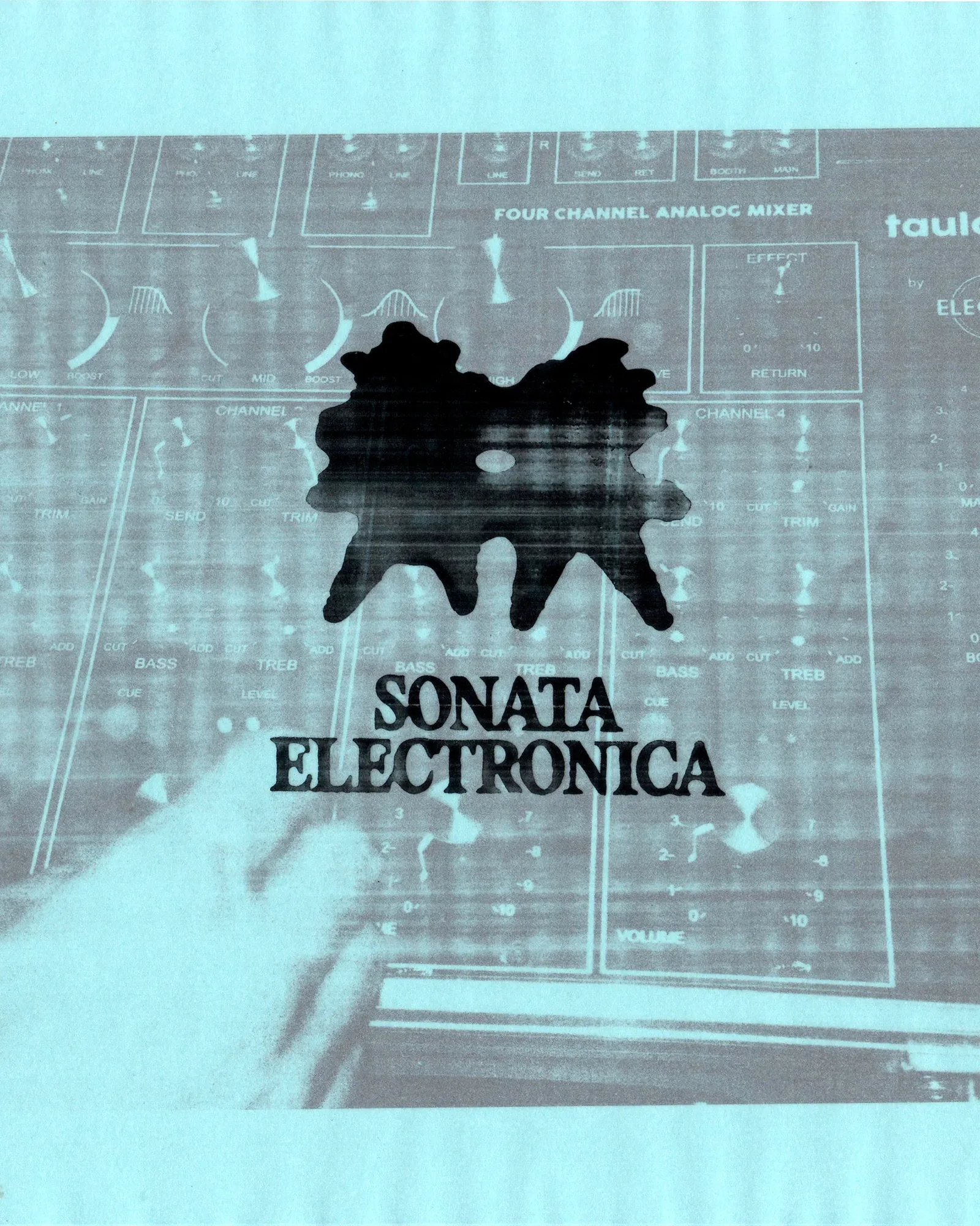
Textures aren’t new. However, what’s new is where they come from. Of all the design trends here, this is the cheapest to try. Instead of a stock grain pack, designers scan or photograph something real that belongs to the brand or the idea, then build with it.
The searchable name. “Real textures” is too vague to rank. So go with scanned textures, scanner aesthetic or photocopy texture. Similarly, It’s Nice That filed this under a print trend it calls “Make me a copy”, and Stills’ 2026 report calls it scrapbook/scanner.
Why it leads the 2027 design trends
AI image tools still fake texture badly. It’s Nice That argues that generators struggle to replicate a layered, mixed-media look, so scanned and heavily textured work will keep growing. Notably, a scan carries dust and paper shadows that generated noise doesn’t have.
These design trends in real campaigns
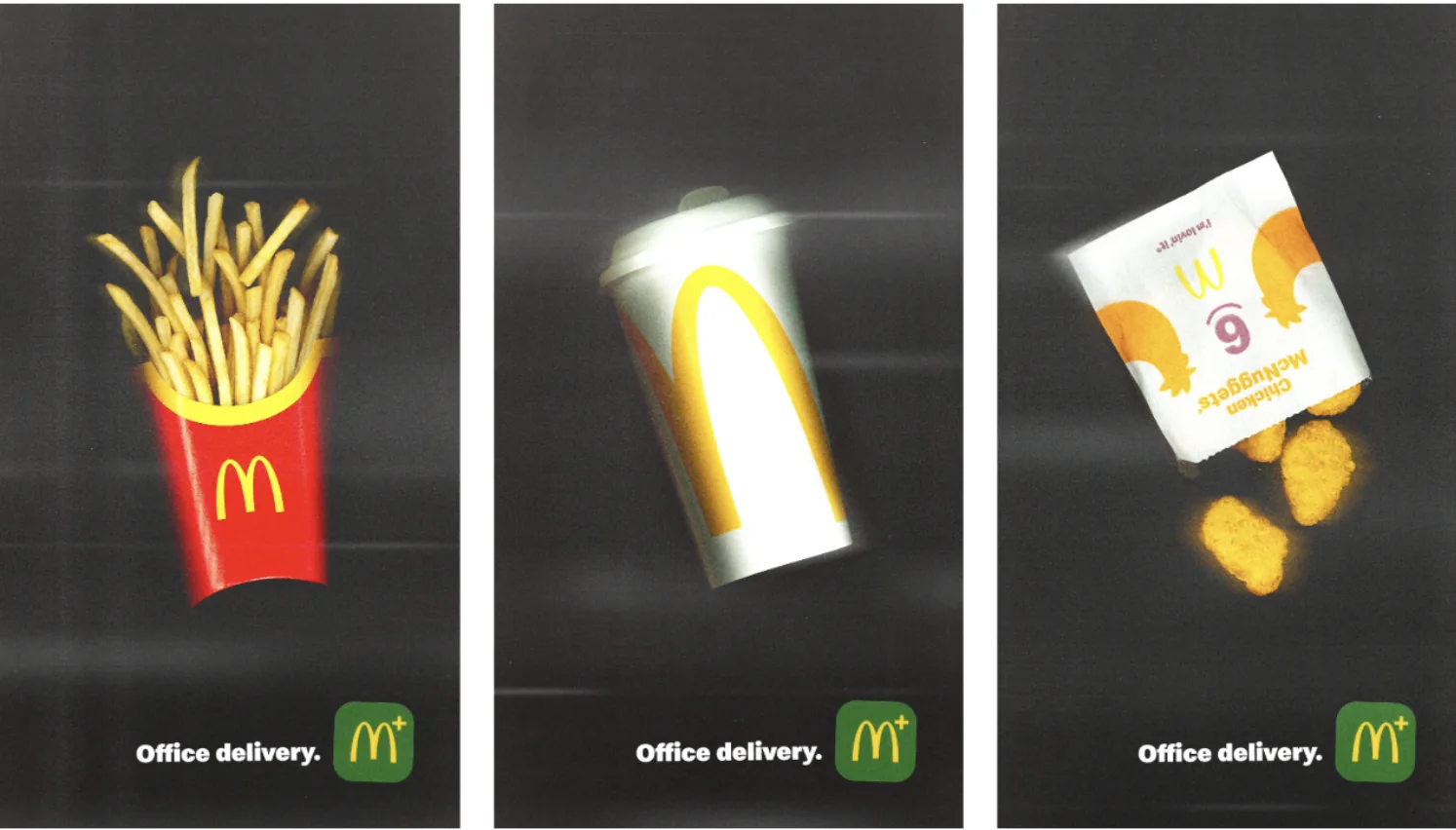
- McDonald’s France, “Office Delivery” (May 2026). TBWA\Paris placed burgers and fries on office scanner glass and emailed the scans to more than 235,000 office workers. The texture is the media.
- Photocopier grit in identities. It’s Nice That cites Charlotte Rohde’s Oficía Mono launch and How&How’s Big Cartel branding, both built on grayscale pages and scanner debris.
- Handheld scanning. Designers like Jacob Hutch now drag handheld scanners across objects for warped, smeared results.
Step one, for both tools
Scan something. Generally, a flatbed works best for flat objects. One designer’s tip: scan at 1200 dpi in image mode with auto settings off, with gray paper behind the item so it’s easy to cut out. A phone photo in flat, even light also works.
How to make it with Nano Banana Pro
Image 1 is my product photo. Image 2 is a flatbed scan of crumpled receipt
paper. Place the product as if it was photocopied: high contrast, grayscale,
black toner speckles, a dark edge where the scanner lid didn’t close. Use
image 2 only as the paper texture behind it. Keep the product shape exact. 3:4.
How to make it with Claude
In Claude, use the scan as a real layer in the layout instead of a simulated filter.
Build a gig poster in HTML, A3 ratio. Use my attached scan as a full-bleed
background with mix-blend-mode: multiply. Set the band name in a heavy condensed
sans, slightly misregistered like a cheap print (offset a second copy by 2px
in red). Don’t add any generated noise. The scan is the texture.
In fact, the best scans come from things with a story. For example, your brand’s actual receipts, packaging, notebooks or fabric.
5. Surreal design and CGI worlds (FOOH)
Surreal design builds slightly wrong worlds. It is the most cinematic of these design trends. For example, objects at the wrong scale. Cities that look real until they don’t. Think Salvador Dalí, but for a product launch.
The searchable name. “Surrealism” gets searched, but it pulls art history results. For the marketing version use surreal design and FOOH, short for fake (or faux) out-of-home: CGI ads that look like real billboards or street installations but only exist online, as Digiday explains. Similarly, Canva calls the wider mood Reality Warp and saw a 220% jump in searches for “liminal” and “uncanny”.
Why these design trends keep scaling
In contrast, this is the only one of these design trends that can fight AI or be made with AI. For example, a giant handbag rolling down a Paris street is fiction either way. Above all, it stops the scroll, and it shows a brand has a sense of play. And if you would rather build the whole surreal world in a browser, here is how I built a WebGL website in Cursor.
Design trends already shipping
- Savage X Fenty at New York Fashion Week (September 2026). Giant lingerie appeared to hang over Seventh Avenue, casting bra-shaped shadows across the street. The studio behind it, Vertex CGI, told WWD Japan that nothing was installed and no crew went out. The footage was AI-generated and composited into real New York streets.
- Amazon Prime Day (June 2026). Giant Charlotte Tilbury lipsticks dragged behind Prime vans, painting red trails that spelled out the sale dates from above.
- Jacquemus. The fashion house that made FOOH famous, with oversized handbags driving through Paris like cars.
One caution. Some in the outdoor ad industry call FOOH misleading when it borrows real locations. So label it as CGI or AI in your caption.
How to make it with Nano Banana Pro
Of course, this is Nano Banana Pro’s home turf. Start from a real photo you took so the light and perspective are genuine.
Image 1 is my photo of a city street at golden hour. Add a giant ceramic
coffee mug, about four stories tall, sitting in the middle of the road.
Steam rises from it between the buildings. Match the sun direction in the
photo so the mug casts a long shadow across the crossing. Cars and people
stay normal size. Photoreal, 9:16, 4K.
How to make it with Claude
Meanwhile, use Claude for the frame around the scene. For example, a launch page that zooms into the surreal image on scroll, or a poster where the type interacts with it.
Build a single landing page. Hero is my attached surreal street image.
On scroll, slowly zoom into the giant mug and fade in the headline
“Coffee, but bigger.” One CTA button that says “Find a café”. Keep the
type small so the image does the talking.
In short, good surreal work changes one thing about reality. Change five, however, and it’s just a fantasy poster.
6. Expressive custom typography
Finally, type with a personality of its own. Several of the design trends above end up in the type. For example, your handwriting, letters drawn in hot sauce, a custom face built in Illustrator, or a weird font you found and own the look of. The opposite of yet another clean sans serif paired with Instrument Serif.
The searchable name. However, “personality typography” isn’t a search term. Instead, people look for expressive typography, custom typeface and handwritten fonts.
Why it’s taking off
AI tools default to the same few safe fonts, so the type is often the first thing that makes a design read as generic. Isabella Wordsworth of Dalziel & Pow put it bluntly in Creative Bloq: “typography is no longer supporting the design: it is the design.” Jessica Walsh, founder of &Walsh, expects more brands to pay for custom type to stand out now that AI has made everything else cheap.
Design trends you can point at
- Oatly. Its hand-drawn, slightly crooked wordmark is still the reference point for expressive type in branding.
- “Pick and mix” lettering. It’s Nice That tracked deliberately mismatched lettersets, where expression beats legibility, in posters by Eva Rotreklová and Juliette Dupont Duchesne.
- Handwriting as an accent. The 2026 version of handwritten type is used for a single word or tagline, paired with a restrained sans, not set across a whole layout.
How to make it with Claude
In fact, this is where Claude shines. Specifically, it draws letterforms as SVG paths and animates type with CSS. Still, tell it which fonts to avoid, or it drifts back to the defaults.
Draw the word “Late Shift” as custom SVG lettering. Make it look like
letters cut from paper with scissors: uneven baselines, slightly different
heights, small notches at the corners. Don’t use Inter, Instrument Serif or
any geometric sans. Give me two color versions and a 3-second CSS animation
where each letter drops in with a tiny wobble.
How to make it with Nano Banana Pro
Nano Banana Pro is strong at rendering text inside an image, so use it for type made of materials. Likewise, Google’s tips say to state the exact text, placement, weight and font style.
The word “SPICY” written in hot sauce on a white diner plate, thick
uneven strokes, a few drips, a fry resting near the Y. The letters must
spell SPICY exactly, all caps, centered. Overhead shot, harsh flash, 1:1, 2K.
In short, you don’t need a type designer for this trend. Rather, you need one word set in a way nobody else would set it.
7. Ugly, naive and folk design
The most speculative of these design trends. For example, remember the bake sale flyer made in Microsoft Publisher? In other words, Comic Sans, WordArt, clip art, a starburst that says FREE. That kind of design is starting to stand out again, because everything around it now looks AI-made.
The searchable name. Some creators call this “dumb design”, but that won’t rank. So use ugly design, anti-design or naive design. Notably, Creative Bloq has a lovely name for the old amateur style: folk design, the stuff people built in Photoshop or MS Paint.
Why these design trends refuse to die
Basically, AI flyers all look the same. Creative Bloq’s August 2026 piece on the flood of AI-made flyers explains why: image generators drift toward a statistical average, so even detailed prompts come out bland. Some small businesses now announce they’ll go back to pen and paper. Meanwhile, writer Kyle Raymond Fitzpatrick argues in Creative Review that messy design has become a kind of proof of life.
Real examples of these design trends
- Jolene, London. The restaurant’s Studio Frith logo was drawn by the founder’s six-year-old daughter.
- Designers redesigning AI flyers. Illustrators and studios on Instagram now post their fixes of terrible AI flyers, as Creative Bloq documented.
- “The Worst FOOH” for Battimix. A Peruvian yogurt brand mocked CGI ads with a deliberately bad, flat JPEG of a giant yogurt. It got a national conversation going.
How to make it with Claude
Here’s the funny part. In fact, AI is bad at being bad. For example, designer Antonio Cabrera found in his Ugly Poster Project that AI struggles to make something genuinely, intentionally ugly. So don’t ask Claude for “ugly”. So give it the rules of folk design.
Make a flyer for a neighborhood plant swap, letter size, in HTML.
It should look like a retired teacher made it in Microsoft Publisher in 2004.
Rules: center-align everything. Use Comic Sans for the body and a rainbow
WordArt-style gradient on the headline. Add one clip-art style sunflower and
a red starburst that says “FREE!!”. Uneven spacing. Keep the date, time and
address big and easy to read.
How to make it with Nano Banana Pro
Finally, use Nano Banana Pro for the real-world mockup, which sells the joke.
Image 1 is my flyer design. Show it printed on cheap copy paper, taped
slightly crooked to a wooden telephone pole with clear tape, a little
curled at one corner, next to faded older flyers. Overcast daylight,
shot on a phone, 4:5.
Ugly still has to work. If people can’t find the date and place in two seconds, it’s just bad.
Claude or Nano Banana Pro: which tool for which design trends
Use Nano Banana Pro to make images and Claude to make layouts. In practice, most of the design trends above need both. Because plenty of this ends up in Figma anyway, here are 8 unexpected things we shipped with Figma Make.
| Claude (with Claude Design) | Nano Banana Pro | |
|---|---|---|
| What it is | Anthropic’s assistant. Claude Design (Anthropic Labs, April 2026) builds designs, prototypes, slides and one-pagers through conversation | Google’s Gemini 3 Pro Image model, launched November 2025 for image generation and editing |
| How it works | Writes the design in code (HTML, CSS, SVG) | Generates and edits pixels from text plus reference images |
| Best for | Layouts, type, vector mascots, carousels, landing pages | Real materials, textures, surreal scenes, 3D mascots, text inside photos |
| Key limits | Not an image generator. Photoreal scenes need an image tool | Exact spacing and brand grids are harder. Images carry a SynthID watermark |
| Inputs | Prompts, images, DOCX, PPTX, XLSX, your codebase, web captures | Prompts plus up to 14 reference images, up to five consistent people |
| Output | Canva, PDF, PPTX, HTML, or a handoff to Claude Code | JPG, PNG or WebP at 1K, 2K or 4K |
| Access | Research preview on Claude Pro, Max, Team and Enterprise | Gemini app (free tier), Gemini API, Google AI Studio |
A simple workflow for these design trends
- Write the brief in Claude first. Name the trend and the one thing that should feel human.
- Make the hero image in Nano Banana Pro, using a real photo or scan as a reference wherever you can.
- Bring that image into Claude Design and build the layout and type around it.
- Export to Canva or PDF for final tweaks, or hand it to Claude Code if it’s becoming a website.
- Say in the caption that AI was involved. Audiences already spot it, so own it.
Above all, a useful habit for any of these prompts: tell the AI what not to do. In fact, In fact, “No gradients, don’t use Inter” does more for an anti-slop look than a paragraph of adjectives. The same rule works on copy, which is why humanizing AI text starts with a list of bans.
FAQ about 2027 design trends
What are the biggest graphic design trends for 2027?
Specifically, the big design trends are handmade and analog design, brand mascots, visible process, scanned textures, surreal CGI (FOOH), expressive custom typography and deliberately ugly or naive design. They share one idea. As AI makes polished visuals cheap, design that shows a human hand or a strong personality stands out.
What is anti-AI crafting?
Anti-AI crafting is design that rejects AI’s smooth, polished look in favor of visibly handmade work, such as stitching, paint, collage and analog photography. Landor’s Graham Sykes used the term in Creative Bloq’s 2026 forecast. For example, Apple’s hand-embroidered event invite from October 2026 is a well-known example.
What is FOOH in advertising?
FOOH means fake (or faux) out-of-home. Specifically, it’s a CGI or AI-generated video that makes an ad look like a real billboard or street installation, like giant lingerie hanging over Manhattan. It only exists online, so it’s cheaper than a real stunt, but brands should label it to avoid misleading people.
What is cutewashing?
Cutewashing is Fast Company’s term for tech companies using cute mascots to make AI agents feel friendly and trustworthy. For instance, examples include Meta Muse’s Jolly and OpenAI’s dots. Critics say cuteness can make people forgive mistakes from a technology that still gets things wrong.
Is minimalism dead in 2027?
No. Minimalism is changing rather than disappearing. Instead, Creative Bloq notes brands updating it with heritage logos and sharper contrast, and Canva tracks an “Opt-Out Era” of stripped-back visuals for people tired of digital noise. What’s fading is the generic flat look that AI tools now produce by default.
Can AI make design look handmade?
Yes, with help. Upload a photo or scan of a real material to Nano Banana Pro as a reference and describe the texture you want. Then build the layout in Claude. As a result, one real scanned element makes AI output look far more human than any prompt alone.
Is Claude or Nano Banana Pro better for graphic design?
They do different jobs. Nano Banana Pro generates and edits images, including textures and text inside photos. Claude builds layouts, typography and vector graphics in code, and Claude Design exports to Canva, PDF, PowerPoint and HTML. For most trend-led work you’ll want both.
Sources for these design trends
Trend reports
- Texture, warmth and tactile rebellion: the big graphic design trends for 2026, Creative Bloq, December 2025
- Canva unveils 2026 design trends: the year of Imperfect by Design, Business Wire, December 2025
- Canva predicts 2026 will be Imperfect by Design, LBB Online
- Canva backs Imperfect by Design trend in 2026 report, eCommerceNews, January 2026
- Global Design Trends 2027, Klingit
- The graphic trends you’ll want to bookmark for 2026, It’s Nice That
- Stills trends report on human-centred design in 2026, Creative Boom
- Design trends 2026: what is naive design, DesignRush
Handmade and process
- Its embroidered logo invite shows Apple understands something other tech brands don’t, Creative Bloq, October 2026
- Figma’s Source Material series, Figma on YouTube
Mascots
- Big Tech is cutewashing its AI agents, Fast Company, October 2026
- Meta gives Muse an adorable mascot amid AI doomerism, Axios, September 2026
- The most important branding tool in 2026 isn’t what you think, Creative Bloq
- Crocs introduces Niles, Crocs press release, August 2026
- Meet Niles, the croc putting a face to Crocs, Marketing-Interactive
- Wikipedia unveils adorable mascot for 25th anniversary, Creative Bloq, January 2026
- Liberty Biberty protest, Boston Globe, October 2026
- I want to punt Meta’s Muse AI mascot back into the cursed void, PC Gamer
Textures
- McDonald’s used an office photocopier to shoot their latest campaign, Famous Campaigns, May 2026
- Scraps and a scanner, Tabitha Emma
Surreal and FOOH
- Savage X Fenty casts giant lingerie shadows over New York, Famous Campaigns, September 2026
- Vertex CGI on the Savage X Fenty video, WWD Japan
- Amazon Beauty giant lipsticks leave trail across city, FOOH.com, June 2026
- What Maybelline’s faux OOH ads say about the future of advertising, Digiday
- Fake OOH: the next frontier or misleading stunts?, AdNews
- Fake out-of-home: advertising with a wow effect, Adello
Typography
- Typography trends, Wix
- Font trends 2026, Made Good Designs
- Top 7 logo design trends in 2026, Onething Design
Ugly and folk design
- Graphic designers are trying to fix people’s terrible AI flyers, Creative Bloq, August 2026
- Why it’s time to take ugliness seriously, Creative Review
- Awful giant yoghurt TikTok mocks CGI OOH trend, LBB Online, July 2024
- The Ugly Poster Project, Antonio Cabrera (no longer online)
Tools
- Introducing Claude Design by Anthropic Labs, Anthropic, April 2026
- Prompting tips for Nano Banana Pro, Google
- Google launches Nano Banana Pro, eWeek, November 2025